Click the picture to download a PDF of this story.
By Jesse Carleton, jcarleton@nrha.org
See, Stop, and Shop
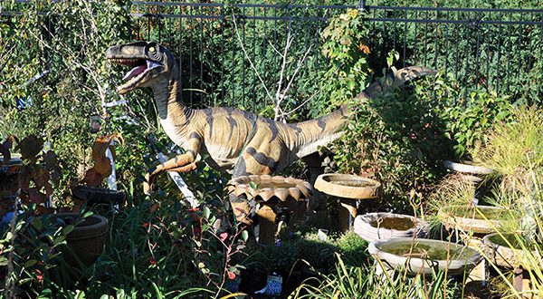
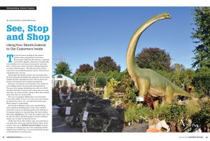
The brontosaurus standing in the outdoor garden center and poking its head above Beisswenger’s Hardware has become a landmark around New Brighton, Minnesota. Undoubtedly, most children see it and tug on their parent’s arm to go have a closer look, which is just fine with Jim Neumann, co-owner of the business. “The dinosaur draws kids to come in the store with their parents and to visit our lawn and garden area,” he says.
Beisswenger’s has found a creative way to execute one of the basic principles of retailing. The appearance of your store’s exterior can have a big impact on how well you attract new business and keep previous customers coming back.
Of course, you need to cover the basics: The exterior of your building needs to be clean and well-maintained.
You need clear signage and parking areas that are well-lit. For those first-time customers who venture into your store, what they see on the outside is going to affect their attitude about what they see on the inside.
But if you are going to differentiate your store from every other retailer in town, you want cars to slow down, get passers-by to give you a second look and then give them a reason to come inside.
In the final installment of this year’s merchandising series, Hardware Retailing takes a look at how retailers around the country are dressing up their store exteriors to encourage customers to stop and shop. For some retailers, that means highlighting a few of the key products they have for sale. For others, like Beisswenger’s, it means finding a unique way to stand out from the crowd.
Let the ideas from other retailers spur your creativity as you think about how your storefront looks to those on the outside. Then, go to TheRedT.com/cole-windows to learn strategies for creating innovative and compelling window displays from Noelle Nicks, visual merchandising manager at Cole Hardware in San Francisco.
 1. Bulk up.
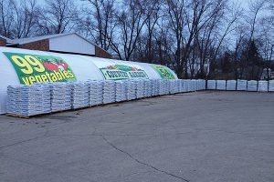
At Whitmore Ace, outdoor signage and stacks of soil and fertilizer let customers know right away: This is a lawn and garden destination. Stacking bagged goods outside a store sends the message that it’s the place where customers can get as much as they need and that prices will be competitive. Becker is strategic with the layout of the pallets, too. “We lay out the parking lot with the best soil toward the greenhouse, putting them closer to the plants,” she says. “The premium product is out front so customers are sure to see it.” When merchandising bulk goods, it’s important to watch for torn bags and remove them so the area stays clean and free of debris.
 2. Use your wit.
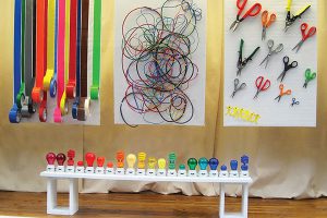
Customers might be surprised when they learn that 95 percent of the items making up the window displays at Cole Hardware are actually for sale in the store. Noelle Nicks has a gift for taking ordinary hardware items and turning them into unique and eclectic works of art. The displays get people’s attention, and often get them in the door. “The window display should be an experience, not a store behind glass,” she says. And while her ideas are witty and creative, she says creating an effective display also requires meticulous attention to detail. “Pay attention to every detail of the display, including the backdrop, flooring, lighting and levels. Every item has to look like a museum piece.”
 3. Turn heads.
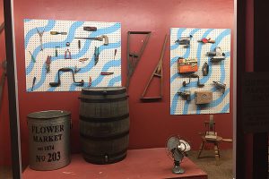
Passers-by are sure to see something unique in the window at Hillsboro Hardware in Nashville, Tennessee. Store manager Jason Mathias likes to dig up relics from the past along with unusual items. Arrangements in the windows might include old hand and power tools that give people a glimpse of hardware past. It could be something unusual, such as a 3-foot-long wrench or a large bulb used in theater lighting. “We try to have fun with it,” he says. “Many of the items are real eye-catchers that people aren’t used to seeing. I’m not using the windows for selling or promotions as much as using them to get people’s attention. Then they’re more likely to come inside.”
 4. Get kids excited.
In addition to a brontosaurus, Beisswenger’s is also home to a raptor prowling among the birdbaths and prairie grass. Children visiting the store love to see the dinosaurs, along with a Bigfoot, giraffe and lion. In the meantime, parents are free to browse the store’s extensive offering of lawn and garden goods. According to Neumann, the store’s purchase of the dinosaurs four years ago coincided with the release of one of the “Jurassic Park” movies. “Our local Dairy Queen borrowed the raptor for a promotion they were doing in conjunction with the movie,” he says. “It’s been worth the investment just for the advertising we got from that.”
 5. Set the mood.
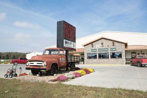
It’s easy for Malinda Milam, owner of M Kay Supply in Benton, Missouri, to give directions to her store. “We tell them to just look for the 1953 Ford truck with the big sign in the back,” she says. When she and her husband were designing the store, she wanted to make the outside of the business something people would remember. She also wanted to make customers feel welcome as soon as they pulled into the parking lot. “If you feel comfortable, you’ll want to come back,” she says. “We wanted the store to be warm and inviting, inside and out. The experience you create on the outside has to carry through the entire store.”
 6. Celebrate seasons.
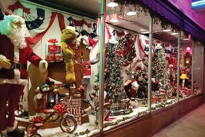
Festive window decorations have become one of the traditions at Jeben’s Hardware in Blue Island, Illinois. Sometimes, they make the difference between someone stopping to come in or just walking by. Employee Judy Tuma blends the old and the new to create her seasonal displays, drawing on props such as an adult-sized rocking horse or an antique motorcycle. “Whatever we might have that is part of our window display, it’s likely to bring people into the store,” she says. “People love seeing the antiques in the window. It’s a way to get people to notice our store even during those hours we’re not open. They often come back just to learn more about us.”
 7. Take the salesfloor outside.
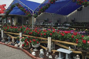
With so much to see outside, it may take shoppers a while before they actually step inside Whitmore Ace Hardware. For much of the year, an area in front of the store is set up with live plants, patio furniture, grills and lawn and garden accessories. It is full of merchandise and is attractive so customers want to stop and browse. “We’ve created an open-air market look,” says Laurie Becker, director of marketing, who works with managers at all six of the business’s locations in northern Illinois to create outdoor displays. “We put add-on products on display alongside the live goods so customers are not running all over trying to find what they need.”
 8. Cross-promote.
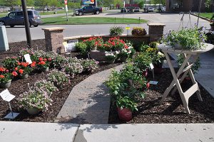
At Howard’s Hardware Hank in Arcadia, Wisconsin, manager Seth Howard makes the most of the limited but highly visible space next to his garden center. He made the area more inviting with some help from a landscaping contractor in town. “We don’t sell the pavers or bricks, but we can give customers the name of a local contractor who can help if that’s something they want for their yard,” he says. It’s also one more step he can take toward improving the outside of the building. “The more attractive exterior has made it more appealing to people,” he says. “They’re likely to think, ‘If it’s nice outside, the store must be nice inside, too.’”
 9. Make it a quick take.
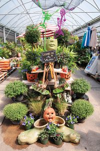
Items from both the garden center and gift shop are on display at the Ace Hardware in Cocoa Beach, Florida. Stephen Nichols, manager, creates seasonal displays that incorporate products popular in his area. The outdoor display is meant to be only a sample of what’s inside the store. “We use these outdoor areas to give customers an idea of what they will find in different areas of the store,” he says, adding that it’s also important to not overwhelm customers with too much merchandise. “A good display lets them take in quickly what you have to offer and give them a taste for what is inside. It needs to be free of clutter and not too busy.”
 Hardware Retailing The Industry's Source for Insights and Information


