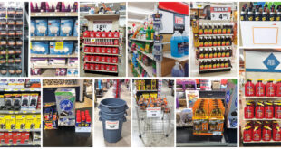
To view a PDF of this story, click here.
When it comes to merchandising your store, you can’t always follow the textbook. Customers don’t always look at what you want to sell them, so sometimes you have to get creative so they hear the message.
That’s what’s been happening at T & M Hardware and Rental, with five locations in Pennsylvania and one in Ohio. Each location is unique, and they range from standard modern retail spaces to smaller salesfloors shoehorned into older buildings. Each building represents its own set of merchandising challenges.
Hardware Retailing visited three of those locations to see how staff reworked standard merchandising techniques to drive sales. No matter the shape and size of your building or how difficult the merchandising challenge, the ideas from the T & M staff might help you find some solutions.
Create New Shopping Habits
Store Location: Harmony, Pennsylvania. In an 11,000-square-foot building constructed for modern-day retailing, this is owner Tim and Mary Post’s showpiece. It sits off a main highway near a shopping district and draws a mix of contractor and consumer customers.
Challenge: This past year, Scott Post, sales and rental manager for the company, presented employees with a company-wide sales goal: Add one extra dollar to every transaction and add one extra transaction per hour. Meeting that goal has involved finding new ways to merchandise.
Becky Guisler, sales support for the company, tackles the challenge by watching how customers shop. She noticed that when customers walked in, they seemed to ignore the first one-third of the store. “No one was looking left or right or slowing down. It was as if they had their blinders on,” she says. People were coming to the store and heading straight to their destination items, instead of noticing those other items that might not be on their list.
There was something else she wanted to fix: “I noticed there was a huge lack of women shoppers. The ratio of men to women was about 10 to 2,” she says. “One of my goals is to drive sales to women shoppers.”
Strategy: Guisler wants customers to start shopping as soon as they walk in the front door, picking up impulse items and increasing their transaction sizes. For female shoppers who come into the store, she wants to have home decor and gift items. But since the store isn’t necessarily known yet for those items, she uses her merchandising skills to start reshaping that image. Her strategy involves both major changes to the store’s look and feel, as well as some minor tweaks.
 See it from a different angle.
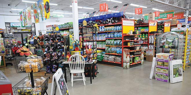
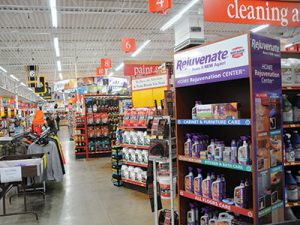
If customers walking in the store are looking straight ahead and focused on what they came to buy, then the aisles most likely to be missed are those directly on either side of the door. To interrupt that tunnel vision, Guisler set the first two endcaps of the store at a slight angle so they’re facing customers as soon as they walk in. “It gives our customers more of a chance to see something they might otherwise miss,” she says. The space behind the angled endcap gives her an opportunity to place items related to what’s on the display.
Create open space.
While on one side of the front door Guisler has angled the endcaps to grab shoppers’ attention, on the other side she went for a different tactic. There were too many shelves crowding that area, which meant most customers weren’t paying any attention to it. While it’s important to maximize a store’s square footage, good merchandising isn’t necessarily about seeing how much product will fit in the store, but rather how to get customers to notice what’s there. And sometimes less is more. If customers were going to stop and shop the front of the store, Guisler recommended opening up the space to draw them in.
She removed a run of shelving from the outdoor living and sporting goods department, which is located at the front of the store, creating a mini power aisle. Now, the power aisle provides an area for showing grills, while the open space creates more visibility for products on surrounding gondolas.
To further capitalize on that space, Guisler uses the area to reinforce some of the brand names of sporting goods the store carries, including Yeti, Carhartt and Weber. Heavily branded product displays with vendor signage helps establish that T & M Hardware and Rental is a destination for brand names.
 Create a unique shopping area.
As she looked for a niche that would bolster store traffic, particularly among female shoppers, Guisler turned to home decor and gift items. But the challenge is that, up to this point, the store hasn’t been a destination for those items.
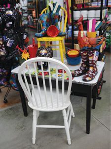
To make the sale, she relies on impulse and inspiration. To help with the impulse part of the sale, Guisler placed the category near the front of the store so it’s easily visible to shoppers. To help inspire them to make that impulse purchase, she has created a unique shopping space with products that are colorfully and creatively merchandised.
For example, she replaced standard shelving with some unique tables that have a more vintage appearance. “We’ve given the area the feel of a gift shop,” she says. “It feels more inviting than just standard merchandising. I feel like it’s a place where customers will want to stop and look.”
She keeps the price point of most of those items under $20, as that seems to be the ideal range for an impulse buy. If customers aren’t looking for something for themselves, it’s likely they will shop for a gift. Like the sporting goods department directly next to it, a departure from the typical run of 7-foot shelving means the area has open space, so shoppers are more likely to notice it.
Small changes have large returns.
Not all of the changes at the Harmony store have been major; small adjustments or embellishments have also had a big impact. For example, in all of the T & M Hardware and Rental stores, pegboard behind the displays is painted brown.
“The merchandise pops out on the dark background as opposed to the standard white background,” says Samantha Post, marketing and human resources manager for the store. “Your eye is more likely to catch the product on the hook or shelf.”
The paint department is another area that received a lot of attention last year. Post and her team gave it an overhaul with a new paint counter and new signage. Then to add in some additional fun, they hung paint can lids, painted in different colors, along the bottom of the paint department signage. “It creates a little fun and draws customers over to see what is happening over there,” Post says.
Interrupt the Customer
Store Location: Bellevue, Pennsylvania. This charming borough of Pittsburgh has a small-town feel with a young, urban demographic. Many of the shoppers come to the store on foot or via public transportation.
Challenge: This building already had an existing hardware store when the Posts purchased it. An older building in an urban area, it has two levels, and the staircase leading to the lower level is what customers walking in the door see first. The stairway eliminates the possibility of a power aisle and, therefore, the store doesn’t have space for traditional endcaps or pallet displays. Downstairs, the ceiling is low and a bulkhead in the architecture makes it difficult to fit a standard vendor planogram. There are also blind areas out of the normal flow of traffic that customers often miss.
Strategy: Samantha Post manages marketing and human resources for the entire company, but also spends most of her time at the Bellevue location. As she and staff tackle the limitations posed by the store’s layout, she says it is helpful to watch customers as they shop the store. What are their normal traffic patterns? What areas of the store receive the most traffic? What areas are ignored? She and her staff have devised a strategy that focuses on creating opportunities for impulse items and finding ways to divert shoppers away from their normal shopping habits.
 Encourage impulsive behavior.
Perhaps the largest store layout challenge at Bellevue is the staircase directly in front of the door. As a solution, Post fills the front portion of the store and the area around the stairway with impulse items, such as spirit wear for the Pittsburgh Steelers. Locating several niche and unique items in one, highly visible location solves another problem too. Given the layout of the salesfloor, traditional endcaps and pallet displays are not practical. Instead, Post uses the front of the store for products that otherwise might be placed on those types of merchandisers.
Another effective location for an impulse display is near the key machine. As shoppers stand waiting for a key to be made, they browse through a dump bin full of discount items. “Just about everyone takes a minute to rummage through it,” she says. “Everything is priced at $1.49, so it’s an easy way to raise transaction size.”
Employees are talking merchandisers.
Having impulse items available is only half of Post’s plan for selling them. She encourages employees to prompt the sale.
For example, as plumbing is one of her store’s most popular departments, one of the most common add-on items is pipe tape. “We always have that at the front cash register counter. It’s like going to the post office, when they always ask you if you need to buy stamps. If someone’s working on a plumbing project, we always ask them if they need pipe tape,” she says. While that’s a small sale, every extra dollar adds up. She says employee training is an important complement to merchandising, because they need to know what add-on items to suggest with each project.
For that reason, Post emphasizing training for cashiers. “We call our cashiers our marketing assistants,” she says. “That is the person every customer will interact with and usually the first and last employee they see.” It’s important that cashiers know where everything in the store is and have as much product and project knowledge as they can. If a customer arrives at the checkout and has forgotten to pick up an item important to the project, the cashier should be able to suggest the necessary add-on items.
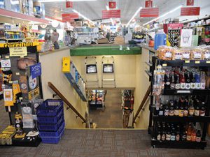 Please interrupt the customer.
“Most shoppers have their blinders on when they come in and out of the store,” Post says. “They are only focused on that item they came in to buy. So we’ve been focusing on putting interruptions in their path to remind them of something else they might need.”
Her favorite example is a giant M&M displayer that holds assorted candy. She placed it near the corner of some of the most frequently travelled aisles in the store, and shoppers began putting candy bars in their shopping baskets. While those shoppers might not have been thinking about food initially, Post says the power of suggestion can lead to an impulse sale. This simple merchandiser has become one of the store’s most effective impulse displays.
Post is also working on interrupting people who haven’t yet walked in the store. Since it’s on a busy urban street with a lot of passersby, Post uses that to her advantage by converting the area in front of the store by the sidewalk into usable merchandising space. With some shelving and racks outside, the sidewalk space is an area for impulse items, which helps draw more shoppers into the store.
“Use the display as the interrupter,” she says. “Pile something up where people don’t expect to see it, and they’re more likely to act on impulse. You’ve just reminded them of something they forgot they needed.”
Cross-merchandising is for destination items, too.
Operating a store in tight quarters with no space for a traditional power aisle or endcaps means Post must find ways to pull shoppers to all areas of the store, not just their favorite spots. Cross-merchandising is a valuable tool.
A good example is the housewares department. It’s in a room off to the side of the main salesfloor and out of the regular flow of traffic, so most customers pass by it.
“Housewares seems to be that area no one knows about,” she says. “So we’ve been putting some destination items there that are usually in another department, but are also tangentially related to housewares. That helps bring customers to that area.”
For example, while furniture floor sliders may be a good fit for the hardware department, Post puts some of them in housewares. When customers are looking for that item, employees will send them to the housewares department, so they will have the opportunity to find some other products they may not have known the store carried.
In fact, given the limited space in the store, she finds she often doesn’t have the room to display a full planogram all in one space. Downstairs, she’s limited by a low ceiling, beams and posts that take up valuable space. So when it’s time to set up a planogram, Post has to do some rearranging.
Typically, she solves the problem by removing double facings, using clip strips for some of the items or hanging them from the posts or beams crowding the space. But she also puts some of those items in different areas of the store, which allows her to stock a full assortment of products while still providing some cross-merchandising opportunities for these items.
Solutions for Crowded Spaces
Store Location: Ellwood City, Pennsylvania. This is the first store the Posts purchased in 1991. The town is rural, with farmers making up a large portion of the customer base. A warehouse behind the building houses many of the rental items used by all locations.
Challenge: The salesfloor at Ellwood City is long and narrow. There’s an expansion at the back with fishing equipment and pet supplies, as well as the core rental category. But the chief challenge for store manager Steve Lemanski is finding ways to utilize the store’s limited space to stock more merchandise. The salesfloor also offers few opportunities for traditional impulse merchandisers such as endcaps, dump bins or bulk displays. He doesn’t want to waste floor space, but he also doesn’t want the store to feel too crowded.
Strategy: When Lemanski thinks about driving sales through merchandising, he relies on his creativity. Before coming to T & M, he worked for both Home Depot and Lowe’s, so he was accustomed to working with the space of a big box. His strategy for the Ellwood store focuses on driving more impulse sales and tapping into the creativity of his staff.
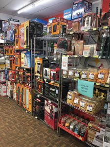 Cut the crowding with narrow shelves.
Near the front of the store, Lemanski wanted a way to increase his shelf space while also promoting his housewares department and some seasonal goods. Since the area he had in mind didn’t have enough space for traditional retail shelving, he set up two back-to-back rows of narrow, open metal shelving, the type typically sold for home organization. He stocks both housewares, such as kitchen totes, along with seasonal items, such as portable heaters. “The shelves are shallow and don’t take up as much space as a typical gondola, but they can still hold a lot of merchandise,” he says. “I’m able to make good use of what was otherwise dead space. It’s allowed us to add another 40 linear feet of merchandise to the front of the store.”
Since the shelves are near the front of the store, every customer will see them. Most of the items on these shelves are those customers might not expect to see in his hardware store, giving them a new reason to come back.
Your staff’s got talent.
Lemanski doesn’t try to come up with all of the good ideas on his own, either. He encourages his staff to contribute. One of his employees, for example, uses her creativity to make unique lamps Lemanski places strategically in visible locations to grab shoppers’ attention. They are usually Pinterest-inspired projects that are easy for customers to replicate or even purchase.
Employees have also offered their ideas for enhancing displays, whether it’s through creative arrangement of the products or decorative motifs that complement the products.
“I encourage our employees to tell me about any good ideas they have,” he says. While he can’t always use everyone’s, he tries to foster an environment that supports creativity. “If I’m open to their suggestions, it gets them excited about what they’re doing, too.”
Last year, staff got excited when Lemanski and a manager from another T & M Hardware and Rental location created a friendly competition between employees at the two stores. Each manager set up a display of smoke detectors near the front counter and challenged their staff to sell more than the other store. Instead of relying on a creative display, they relied on their own selling skills.
“The employees had a lot of fun with that,” Lemanski says. “They would call the other store throughout the day to see how many they had sold. They got pretty competitive. But they also learned to ask customers simple questions, such as, ‘When was the last time you tested your smoke detector?’ to remind them they might need a new one. We sold a lot of detectors.”
Whether it’s suggesting an add-on sale or making sure customers have everything they need for a project, proper training is essential. Merchandising and selling skills go hand in hand. With a bit of encouragement, employees can find new ways not just to merchandise, but to talk to customers about the sale.
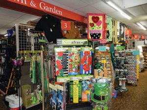 If they see it, they’ll want it.
Walk in to the Ellwood City T & M Hardware and Rental store, and you immediately see a lot of color and attention-grabbing items that will have you stopping to look. Similar to what Post encountered at the Bellevue location, Lemanski has the challenge of finding a way to encourage impulse buys without having much space for traditional endcaps or bulk displays. He overcomes the obstacle by utilizing the front space of the store to show shoppers new or seasonally significant items.
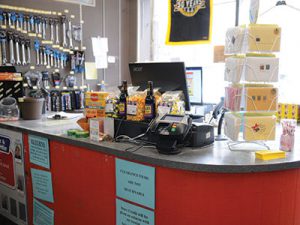
As a start, he’s placed several impulse-type items on and in front of the cashier counter. While he has snacks—always a good fit for this area of the store—he’s also put out some necessities, such as anti-freeze, that customers may have forgotten they needed.
Also at the front of the store, Lemanski uses rolling racks for items he wants to promote in the path of customers entering the store. Since bright colors attract attention, this is a good place for his lawn and garden yard decor items.
When he runs out of space on the floor, he finds room on the ceiling. Hanging yard flags from the ceiling puts them in full view of customers.
 Hardware Retailing The Industry's Source for Insights and Information


