While many elements of home decor remain popular for a few years, color trends evolve and change at a rapid pace.
If your business is deeply invested in the paint category, staying on top of color trends can help you spark a conversation with a customer, which may lead to a sale. Now is a great time to learn the colors chosen by various paint manufacturers as hot trends to follow in 2018 and make a plan for the rest of the year to keep those trends available to your customers.
Read on below to learn about the top trending colors and then download this free training tool from the North American Retail Hardware Association (NRHA) to help educate your team.
For more on past color trends reported by Hardware Retailing, click the links for the years, including 2017, 2016 and 2015 for some added perspective.
Pantone: Ultra Violet
As the authority on color, one of the first places to look at for color trends is Pantone. This year, the company has named Ultra Violet as the Pantone Color of the Year 2018. The company describes the color as a “provocative and thoughtful purple shade, which communicates originality, ingenuity and visionary thinking that points toward the future.”
To bring this purple hue into an interior design theme, homeowners can either bring pops of the color with throw pillows, blankets or furniture. However, some may prefer to go fully bold and paint an entire room.
Sherwin-Williams: Oceanside
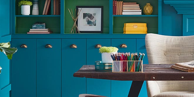
This year, Sherwin-Williams presents its 2018 Color of the Year, called Oceanside. The company describes the color as a combination of “rich blue with jewel-toned green.” As another rich color, it brings a marine, ocean-like quality to a space. The color is very versatile, able to encompass styles ranging from mid-century modern to Mediterranean and more.
According to Sherwin-Williams, Oceanside can be paired with colors that are just as eye-catching, like a bright pink and a rich honey yellow or a more subdued pairing with navy or light blue shades. It would also pair well with corals and copper metallic tones, the company says.
Benjamin Moore: Caliente
Benjamin Moore’s 2018 Color of the Year, Caliente, is also following the trend of rich, bold colors with its passionate red selection. According to the company, the color is a “modern architectural masterpiece,” and it draws the consumer in with its bold strokes.
Again, this would be paired as an accent color in the design of a room or even painted as a statement inside or outside the home.
PPG Paints: Black Flame
While not as vibrant as the previous colors, PPG Paints 2018 Color of the Year, Black Flame, is the definition of bold. The color is a statement-making black infused with an undertone of the deepest indigo.
The color was “selected by PPG’s more than 20 color stylists from around the world, who specialize in industries such as consumer electronics, architectural, automotive and aerospace. These experts study consumer insights, building material trends, decor trends and more to select a color forecast that resonates and is reflective of current consumer attitudes,” the company says.
 Hardware Retailing The Industry's Source for Insights and Information


