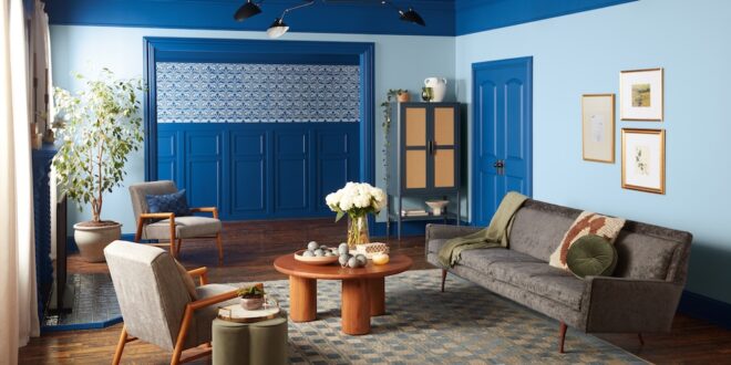
Earlier this week, Valspar announced its 2025 Color of the Year: Encore (available at Lowe’s) and Epic Adventure (available at independent home improvement stores). To learn more about this bold color selection and for more on the strategy behind selecting a color of the year, Paint & Decorating Retailer spoke to Sue Kim, director of color marketing for Valspar.

Paint & Decorating Retailer (PDR): What is your process for selecting a color of the year?
Sue Kim (SK): We do continuous research throughout the year on how color is a part of our culture, the consumer mindset, food, media, travel and overall how consumers experience the world. Then, we determine how people bring those influences and experiences back into the home and how they relate to color decision-making. We consider timing and how that color family is currently being expressed in the world. We also get feedback from retailers. We have a great relationship with our retailer partners, so we rely on them to know what chips are moving out from their stores faster than others and what conversations are they having with their customers. Our goal is for homeowners to look at a color and take it home with confidence that it’s the right choice for them.
PDR: How did this vibrant blue rise to the top for this year’s selection?
SK: There are a lot of trends right now that speak to bolder color choices, for example dark academic and maximalism.
As we’re moving out of the decade of gray, consumers are asking how they can recreate a joyful home and fill their homes with color.
While this color is a bold choice in terms of tonality and saturation, blue is a color family we always go back to. It’s a color family that resonates beyond neutrals, so it often comes back into the conversation. We think Epic Adventure pushes the envelope of brightness. It’s an emotive, dopamine-injected color that is an expression of where the consumer mindset is.
Back when we were forecasting for 2020, we chose blue as a directional color for the entire decade. There was a lot of excitement around starting a new decade, so blue was a grounded color that offered stability. In each decade, we’ve found that blue is a constant, and it’s the brightness, tonality and saturation that changes.
PDR: Can you talk about the trends that complement this choice?
SK: Throughout the pandemic, consumers have been reconnecting and appreciating heritage, vintage and upcycled elements. Coming out of that, people are working on projects where they want to embrace the heritage while also putting a new style statement on it.
We’re living in layers, and a color like Epic Adventure is adding the next dimension. The push of style and fashion and decor and direction, brings a statement to those vintage assets. Consumers are able to redesign and reestablish those styles with these bold statement colors.
PDR: Can you talk a little about the versatility in applications of this color?
SK: This color is so well distributed across Valspar products. It’s able to be mixed into interior and exterior finishes, and as it moves through the home, whether it’s being used in color drenching, for example, or as an accent, you can create a destination. Everywhere you bring this color, it’s so well harmonized into the environment.
PDR: Tell us about the complementary colors that go with Epic Adventure.
SK: We started color forecasting in 2009 with entire color palettes. We have shifted our strategy over the last several years because we recognized that we want to simplify our customers’ journeys.
This year, we chose one color of the year and then we have intentionally chosen complementary colors. When we’re considering those pairing colors, they have to reflect the color story that we’re telling.
New Patina, a sage green shade, emphasizes that heritage, vintage feel that Epic Adventure complements. While Carousel Purple heightens the violet undertone. It can make it a new and refreshing space.
PDR: What else do you want retailers to know about how to use the color of the year?
SK: One thing I recommend is that color of the year is a great conversation starter. When a customer comes in, color of the year helps them understand the trends. When you help them navigate their color selection, they will come back to you because you have become their color expert.
We will see trends evolve, but as consumers are exploring their personalities, we will project that this color is here to stay.
 Hardware Retailing The Industry's Source for Insights and Information


